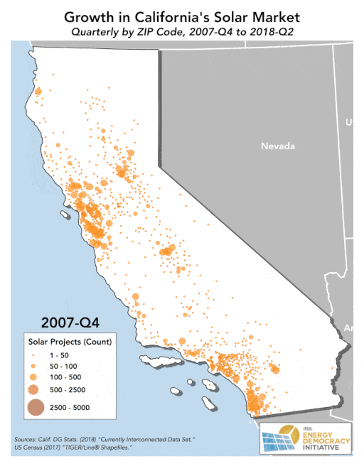
A decade ago, less than 30,000 unique commercial and residential solar projects dotted the California landscape. Today, that number has grown close to 750,000 projects, a whopping amount serving a greater area and share of California’s electricity demand than ever before.
What is even more remarkable about this statewide growth in solar? Each of these projects were planned and installed, not in any particularly coordinated way by the state’s investor owned utilities or public utility commission, but instead by individual actors. An increasing number of homes and businesses in California see distributed solar as the smart economic choice for themselves and their community.
To drive this point home, we visualized the significant growth of solar projects in California over time, drawing on a unique, publicly available dataset of the state’s interconnected solar installations. Our end product? The animated map below that you do not want to miss.
For a state with plans to adopt a 100 percent renewable energy target and one that has taken the lead by adopting another landmark policy requiring all new homes built starting in 2020 to be outfitted with solar panels, the growth in solar is good news for the future of local energy in California and unlikely to reverse course anytime soon.
We encourage you to share this post and animated map (GIF) on social media!
Assumptions and Calculations
The California Distributed Generation Statistics group publishes and maintains the data which underpin this map, as outlined by the California Public Utilities Commission Decision (D.)14-11-001.
The comprehensive, publicly available database (“Distributed Generation NEM Currently Interconnected Data Set”) provides information on all interconnected or net energy metered solar photovoltaic systems within the service territories of California’s major investor owned utilities: Pacific Gas & Electric Company (PG&E), Southern California Edison Company (SCE), and San Diego Gas & Electric Company (SDG&E).
While tracking each unique, currently interconnected project and excluding those that are pending or that have been decommissioned, the database also provides information about projects’ interconnection address location and installation date. We aggregated these unique systems using ZIP code and installation date to create a new spatial database that could be used to display the total solar projects per ZIP code over time.
The solar installations displayed over time on this map are cumulative, with new installations being added to existing ones with each subsequent quarter. For example, the first map in the series contains data from the beginning of the dataset, which goes back until 1996, through to the end (fourth quarter) of 2007. The final slide in the series illustrates all solar installations from 1996 through the end of April 2018, when the most recent data are available.
Following these data processing and visualization steps, we created a series of distinct maps for each quarter and then combined them into a single, animated GIF to illustrate how solar installations have grown in California over time.
This map (CC BY-ND 2.0) and article originally posted at ilsr.org. For timely updates, follow John Farrell or Marie Donahue on Twitter, our energy work on Facebook, or sign up to get the Energy Democracy weekly update.
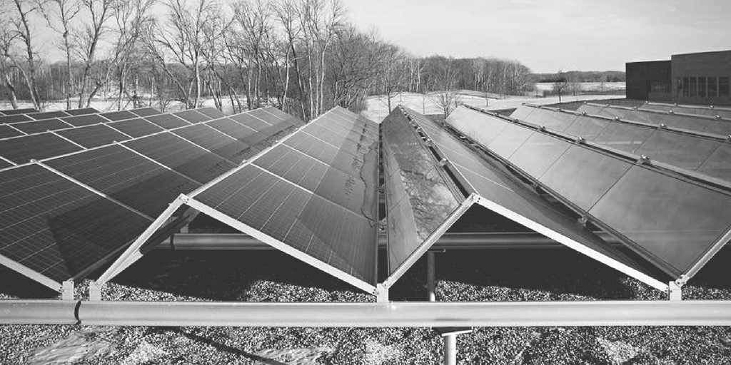
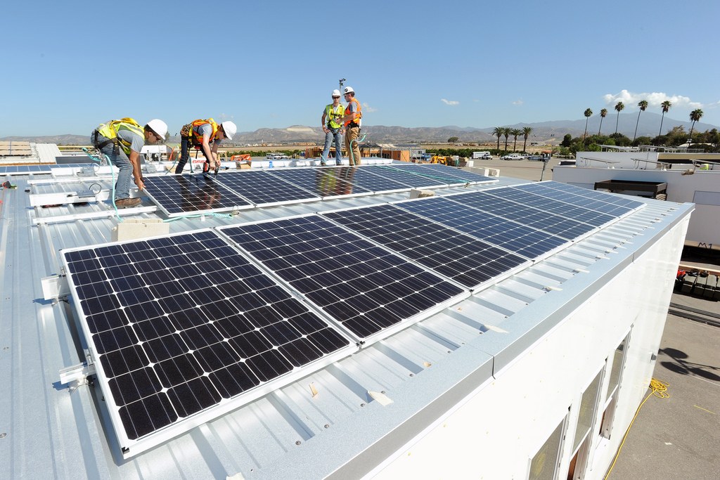
Photo Credits: Department of Energy Solar Decathlon via Flickr (CC BY-ND 2.0)